Sometimes people get into the tendency of thinking that having a surplus of fonts, graphics, colors, and images means that the ending product will be that much more interesting than if they only stuck with the first three decisions they made. Most always, less is more. By using only two typefaces and having a few visuals, there is so much more room to be creative with the layout of the work. Giving yourself more leeway when it comes to design allows for a larger space to expand upon your ideas visually. Here are some ways on how to simplify but enhance your own work.

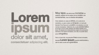
1. Start with content. Figure out everything that needs to be placed on the page beforehand, just so you don’t get into a rut when you think you have completed everything but you actually have a whole paragraph to squeeze in somewhere. If the content has not been given or is in its ‘TBD’ stage, put some placeholder text around your work so that you can move on to the other visuals of the piece.

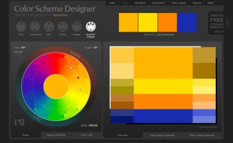
2. The rainbow does not need to be all over the page. Start with black and white, and if the work needs a splash of color to make it more inviting to the viewer, then by all means, add it. Sometimes the work does not benefit from black or white and are strengthened by the intentional mix of various hues and shades of colors. Once you decide on a color scheme, you can always mix and match font and background colors to find the most visually pleasing combination. If you are having trouble finding a color scheme, check out Paletton or the image below to create your own.

3. Why is there a photo of your family on that milk advertisement? Visuals help guide the viewers eye from place to place and can either add or detract from the overall message. Putting an island landscape onto the back of a cereal is superfluous and confuses the consumer unless it has to do with something about a vacation giveaway ticket located in the box or about the new tropical flavor of the product. Making sure that all visuals increase comprehension of the message or connect the dots in some way within the work is very important.

4. Make the message apparent. Placing the band name, title, and any important information in three point font at the very bottom of the page where no one can even see or read it is definitely not something that will catch anyone’s eye, so if you want there to be a catchphrase or name to jump out at viewers, make it big or bold. This is where typefaces come into play. Only use those which make sense with the content and don’t overpower the information that is given.
Overall, these four are only some of the many ways that you can simplify design; however, when I am designing, I find them to be the most useful, especially when I hit some form of writer’s block. Looking around for inspiration also helps get the creative juices flowing, but using these basics as a means for creating work is extremely helpful.
